Blog Archive

Friday, August 31, 2018

Cover Art The Magician's Nephew

I was looking at an article that was about the cover art of "your" favorite books. Except the books listed either weren't my favorites or else I wasn't interested in them or hadn't even heard of them. So Iooked up the different covers from some of my favorite books and I was surprise at how many different covers some of them have had. It was hard to pick a favorite with so much art to choose from.


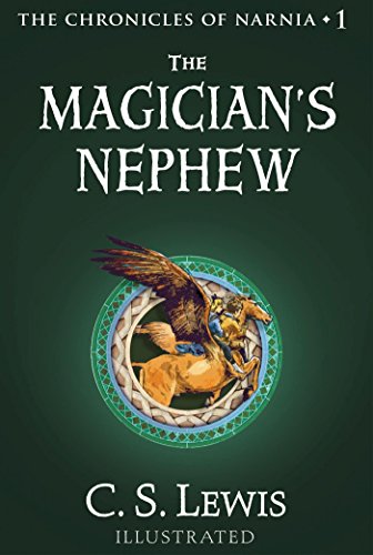
 Today I have covers from The Magician's Nephew, the first book of the Narnia series and my favorite of the set. I don't have a copy of this book specifically. My Narnia set is in a compilation volume with Aslan on the cover. But the first three depict artwork from the chapter headings of the book. It's actually pretty good artwork. More appealing than the original HP artwork.


  The children riding Fledge (formerly Strawberry) features prominently on a lot of the covers as well as the Wood Between the Worlds. I only chose 10 of the best looking covers though. There were others featuring Digory finding the Tree of Youth, but they weren't very clear. I put the most detailed picture of the kids on Fledge towards the end because it stands out to me and I really like it. My favorite three include the classic looking cover with the simple title and picture and the silver apple which features prominently in the story. 


 The best one is the last one that features the rings that they traveled between the worlds with. There's more variety than just this selection. I found some covers that featured the statues on Charn, but they weren't very attractive to me. Last year I posted just artwork in general from each book and the Charn artwork is awesome. But not what you'd want to feature on a cover. Again, it won't be the last Lewis choice I make for these book cover posts.

Thursday, August 30, 2018

Cover Art: Mere Christianity

I was looking at an article that was about the cover art of "your" favorite books. Except the books listed either weren't my favorites or else I wasn't interested in them or hadn't even heard of them. So Iooked up the different covers from some of my favorite books and I was surprise at how many different covers some of them have had. It was hard to pick a favorite with so much art to choose from.


 Today will be a few covers for Mere Christianity. Again, I'm surprised by how many there are for a non fiction book. I don't actually have the individual book. It's part of a collection of Lewis apologetics that are bound in one volume. The cover looks more like this first picture only it has a picture of Lewis himself in the gray area. There's a picture of the most common cover inside and it's the stairs shown both in gray scale and sepia tone. These are the best covers in my opinion as well as that very nice looking (leather?) bound one. That's a beautiful book cover. 


 But there are other options which are fascinating to look at. The birds look similar to the artwork found in Narnia. The simple blue pattern has a classic feel. The Birth of Christ scene isn't the best looking I've seen. But I always like a cover with the author on it as well. Lewis is my favorite, so there'll be more of his covers to come.

Tuesday, August 28, 2018

Cover Art: Journey To The Center of the Earth

I was looking at an article that was about the cover art of "your" favorite books. Except the books listed either weren't my favorites or else I wasn't interested in them or hadn't even heard of them. So Iooked up the different covers from some of my favorite books and I was surprise at how many different covers some of them have had. It was hard to pick a favorite with so much art to choose from.
 Today Journey To The Center of the Earth is my choice. I wasn't terribly happy with the choice of covers. There were more than these ten, but most of them were very unattractive. My copy is the first pic, of course. It's actually not my only copy, but I couldn't find the picture of my other copy on Google... or there were so many I overlooked it.


 Of course, there were plenty of busy covers that tried to feature the entirety of the landscapes and creatures seen by the characters. I'm not too much into the busy covers. They try too hard. Most of them I didn't save. Then there were covers depicting specific scenes or places. And I really like the two water beasts clashing in the subterranean lake. Very imaginative. 


  But the last four are my favorites. The simplest covers work the best for me... or I'm just very boring. The decorative hardbound and that last picture of a barren landscape are the best with the other red inner light and descent as close seconds. There's a seriousness to them that I like. This isn't a book that is taken seriously, obviously, because it's concept is beyond disproven for a long time and it's now more of a kids' adventure book. But I think it deserves a more mature treatment because the whole thing plays out straight faced with the characters earnestly experiencing the journey.

Monday, August 27, 2018

Cover Art: Harry Potter and the Prisoner of Azkaban

I was looking at an article that was about the cover art of "your" favorite books. Except the books listed either weren't my favorites or else I wasn't interested in them or hadn't even heard of them. So Iooked up the different covers from some of my favorite books and I was surprise at how many different covers some of them have had. It was hard to pick a favorite with so much art to choose from.
 Today I've got covers of Harry Potter and the Prisoner of Azkaban. There aren't many of them since the Potter novels aren't old enough to be reprinted dozens of times like the classics. The first one, as always, is the art on the copy I own and I personally don't think there could be a worse picture ever conceived. I've always hated this artwork and it's one of the reasons I shelved the book for so many months after I got it. I was intrigued to see that other covers had been made for the HP.


 It looks like they tried to redo the picture of Harry and Hermione riding the hippogriff but that one doesn't really work for me either. Then there are a pair depicting the end where Harry successfully produces his patronus. I think my favorite of these covers is the second patronus picture with the large stag and that Knight Bus picture is a very close second. Followed by the fortress prison of Azkaban... Much like Monte Cristo, I love the look of old castles.
My HP books are getting worn out too, so I'll need to replace them one day, but unlike my LOTR set, I'm actually torn - I'd like to have more appealing covers but my originalist leanings make me want to replace it with the original covers... the ones that I hate. Lol...

Friday, August 24, 2018

Cover Art, The Fellowship of the Ring

I was looking at an article that was about the cover art of "your" favorite books. Except the books listed either weren't my favorites or else I wasn't interested in them or hadn't even heard of them. So Iooked up the different covers from some of my favorite books and I was surprise at how many different covers some of them have had. It was hard to pick a favorite with so much art to choose from.
Today I'll display The Fellowship of the Ring cover art. Like yesterday, this isn't even half of what I found, but these were the best ones.


 The first picture is of the copy I have. Movie art. But I don't mind movie art if the movies were good and the Peter Jackson trilogy was a decent adaptation. I'd never seen the cover with Gandalf.. I like it better than Frodo. And I think that third one may also depict the movie but I'm not sure. All three are neat looking. 


 Then you have the utilitarian style. Three rings to represent the three races and Sauron's eye in the center of the One Ring. I think the contrasting colors and different positionings of the rings are cool looking. But I like that black cover with one ring in the center the best I think. Yes, I'll call that one my favorite... I like things simple. 


. Then there are the more creative covers depicting different scenes or landscapes from the book. Something tells me that little green copy would be a gem to have in good condition. My second favorite is definitely the last one with Gandalf and the Barlog. Very nicely done even though it's from the movie as well. 

Does anyone have a different copy than these? My set is getting worn out.. so one day I may look into a set with some different artwork on the covers...

Thursday, August 23, 2018

Cover Art Count of Monte Cristo

I was looking at an article that was about the cover art of "your" favorite books. Except the books listed either weren't my favorites or else I wasn't interested in them or hadn't even heard of them. So Iooked up the different covers from some of my favorite books and I was surprise at how many different covers some of them have had. It was hard to pick a favorite with so much art to choose from. So, in no particular order, I'll start with The Count of Monte Cristo
This first picture of this set is closest to the cover of the copy I have. It's a gray cover with that face of Edmond Dantes centralized under the title.


 I like the covers that feature the prison the best and the final picture which shows Dantes in the clouds above the prison is my favorite, not because of the portrait of Dantes, but because it's the best looking fortress. The second of these prison pictures is also pretty cool.


The other covers that contain different scenes are very creative. I quite enjoy that portrait of the inside of the prison and of the ship that Edmond has joined himself to to find the old monk's treasure. The artwork of him walking down the street isn't that interesting, but it's appealing to the eye. The sinister picture of Dantes dangling his three enemies on a string is a close second favorite. And even though the hardcover pictured doesn't depict anything that evokes emotion, it's beautifully made. And these aren't all of what I saw, just the ones I found the most attractive. 

I'll feature other covers of my top ten favorite books in the following days.